Pay attention to these points in the book store LED Chandelier design
Bookstores are the most in need of bright lighting. It is very painful for readers to read and choose. There is not enough lighting in the process of selection, so the lighting layout and setting are an important part of bookstore design.
The purpose of the bookstore lighting design is to correctly convey the book information, show the charm of the book, and facilitate the customer to select books and purchase books, so as to achieve the purpose of promoting sales.
In general, bookstore lighting can be divided into general lighting, local lighting, auxiliary lighting, and accent lighting.
Ordinary lighting is the lighting that transmits book information to readers. Other lighting is mainly to create a bookstore atmosphere and enhance the environmental lighting of the display effect. When designing the lighting of a bookstore, it is necessary to guide the specific design according to the different functions of various types of lighting.
Ordinary lighting ensures that the bookstore gets a certain amount of brightness. In the bookstore, the light of general lighting should be uniform and illuminate the entire bookstore.
Generally speaking, natural LED Chandelier is the best general illumination. It does not have any irritation to the human eye, and it can let the reader see the true color and appearance of the book.
However, natural light is a light source that is difficult to grasp. It is difficult to obtain enough natural light sources in the room, and artificial light can control indoor lighting effects well.
Partial LED Chandelier, auxiliary LED Chandelier and accent LED Chandelier for the purpose of obtaining decorative effects or highlighting key sales areas.
Partial illumination is the illumination that is set up to illuminate a part for a particular visual job. This method of illumination can be used when certain areas of the bookstore cannot achieve sufficient illumination by general illumination alone.
For example, table lamps, floor lamps and even chandeliers can be added to the reading area in the bookstore to meet the reading needs. Focusing lighting refers to the way in which a particular target or area is directed to illuminate, attracting attention.
It can be used in the lighting design of bookstores in logos, posters, decorative displays or new book release areas. This method uses a strong contrast between light and dark to attract people’s attention, thus effectively conveying important information.
These lighting devices are an effective means of shaping their visual image and are widely used in display or display areas that express the unique personality of a bookstore. Such as boutique book display cabinets, new book display racks and so on. Lamps for local, auxiliary and accent lighting can be spotlights, neon lights, curved lights, chandeliers and continuous flashing lights.
There are several factors that should be considered in bookstore lighting design:
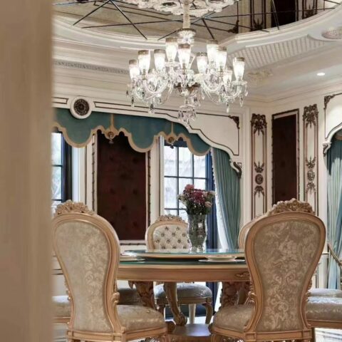
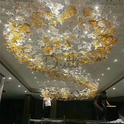
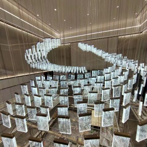
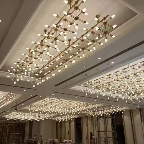
LED Chandelier
In the case of a single luminaire, it is first necessary to determine whether to select a functional luminaire or a decorative luminaire according to different spatial characteristics, architectural forms, etc. of the bookstore.
Functional luminaires are only designed to meet the needs of lighting. The luminaire itself is not part of the bookstore decoration, so when using this functional luminaire, try to “see the light without seeing the light”; when using the decorative luminaire, the luminaire itself is also part of the bookstore decoration. At this time, the uniform shape of the shape of the lamp and the architectural form of the space and other decorative elements should be considered.
Regardless of whether decorative or functional luminaires are used, consideration should be given to factors such as the display of the light source, the color temperature, the beam angle, and the installation of the luminaire (including the mounting height, the mounting angle of the projection angle, etc.).
The lighting of the bookstore has high requirements for color rendering. A standard of Ra ≥ 80 should be achieved in the reading area.
Color temperature is closely related to people’s psychological feelings: low color temperature gives people a warm, warm psychological feeling; high color temperature gives people a feeling of calmness and coolness. The higher the color temperature, the worse the penetration of air, rain and fog. If the color temperature is too low, it will easily cause fatigue in the human eye.
Therefore, the choice of high color temperature or low color temperature in the bookstore lighting can not be generalized. Instead, different design options should be developed according to different needs.
For example, bookstore signs, decorations, etc., which do not need to be viewed for a long time, can use a low-color light source (but not the only one); in areas such as reading areas, cashier areas, etc. where it is necessary to use a long time, it is not appropriate to use a light source with a low color temperature.
The human eye is particularly sensitive to light with a color temperature of about 3000k. Under ideal conditions, the human eye is 20 times more sensitive to this warm yellow light than red or blue light.
Therefore, in the bookstore, such as steps, entrances and other areas that need to be reminded, you can use a light source of about 3000k to achieve this goal. If there is a rest area in the bookstore, you can also use a low color temperature to give people a feeling of comfort and relaxation.
In general, the beam angle is divided into a narrow beam of less than 20°, a medium beam of more than 20° less than 40°, and a broad beam of more than 40°. On the premise that the light source is constant, the larger the beam angle, the better the scattering effect, the larger the spot size and the weaker the center light intensity.
The choice of the beam angle of the luminaire depends on the subject. For example, when illuminating a large-area bookshelf, it is suitable to select a wide beam illuminator to avoid obvious spots appearing on the bookshelf to achieve a soft and uniform effect.
The bookstore’s bookshelves are generally higher than the bookshelves used in the home. When people choose books, they tend to look up. This particular behavior requires that the angle of light should be avoided when entering the luminaire.
The higher the installation height of the luminaire, the better the glare is avoided, and the more favorable the uniform diffusion of light, but the high installation height will result in significant light decay. Therefore, it is determined that the installation height of the luminaire should find a balance between the contradictions according to the actual situation.
Accommodated
There are countless possibilities for the objects in the bookstore besides books, but from the perspective of the attributes of the objects, they can be discussed separately from the two aspects of material and color.
The material of the object to be illuminated includes smoothness and transparency. The smoother the material under the same conditions, the higher the reflectivity. If the light source directly illuminates the surface that is too smooth, it may produce obvious spots or even indirect glare, which is easily overlooked in the design.
Therefore, objects that are too smooth should be avoided as much as possible by direct sunlight. On the other hand, the rougher the surface of the object to be illuminated, the more uniform the diffusion of light on the surface of the object, and the softer the effect obtained.
When light passes through media of different densities, it will refract. Therefore, when directly illuminating the transparent object, the angle after the light is refracted should be predicted to avoid glare after the light changes direction.
There is a close relationship between the color of the object and the color rendering and color temperature. Color rendering itself refers to the degree to which the light source restores the true color of the object, so the relationship between color rendering and the object being viewed is easily understood.
The relationship between the color temperature and the color of the object can be illustrated by the following example: When a red object is illuminated by a full-spectrum light source, the object only reflects red, and the other light colors are absorbed, so the object appears red.
By the same token, when a full-spectrum light source passes through a green aluminum sheet, only green light can pass. When this green light is irradiated on a red object, it is completely absorbed by the red object, and thus the red object looks dull and gray.
In the bookstore, it is not possible to use colored light for illumination, but the color light should be avoided to cause distortion of the color of the object.
Shadow
With the light, there is a shadow, and the lighting design can not only consider the part of the light, but avoid the shadow. A unified grasp of both light and shadow can be considered a complete lighting design. For shadows, design considerations can be made in both control and utilization.
In bookstores, shadows should be controlled as much as possible in areas that do not affect people’s purchase, reading, and work, such as corners, floors, and so on. At the same time, if used properly, shadows can also perform their special functions.
Such as the decoration function: such as the installation of the pattern film in front of the downlight, so that the light not only plays the role of lighting space, but also plays the role of “dot space” decoration; strengthen the depth function: in a picture or in a space The bright colors give people the psychological feeling of jumping forward, and the dim color blocks give people the feeling of retreating. If the clear black and white contrast is applied properly, it can make people feel the space before and after the increase; the function of showing the rhythm beauty: the tree of the mother-in-law Shadow or rhythmic projections are like beating notes. Different combinations form different psychological feelings. The environment that loses shadows loses this kind of interest and loses its level. The contrast is enhanced to highlight the function of the theme: the area where the light shines first Attracting attention, the order of light and dark in space is also one of the important factors for the human eye to observe the order of things. Strong contrast between light and dark can play a prominent role in the subject and subject.


